
Comcast Business: Convergence Design Library
Agency Comcast Business
Role Sr. Designer
Design Lead Brianna Nieman
All roads lead to Comcast Business: Bringing dozens of small business products under one roof (without getting lost along the way)
In 2025, Comcast Business (CB) launched an initiative to rework the entire design system across all CB products. Previously, each product had a somewhat unique design approach, so the goal with this effort was to create a consistent visual landscape for CB users.
This effort spanned nearly the entire organization, with everyone from leadership to content contractors working together to lend a hand.
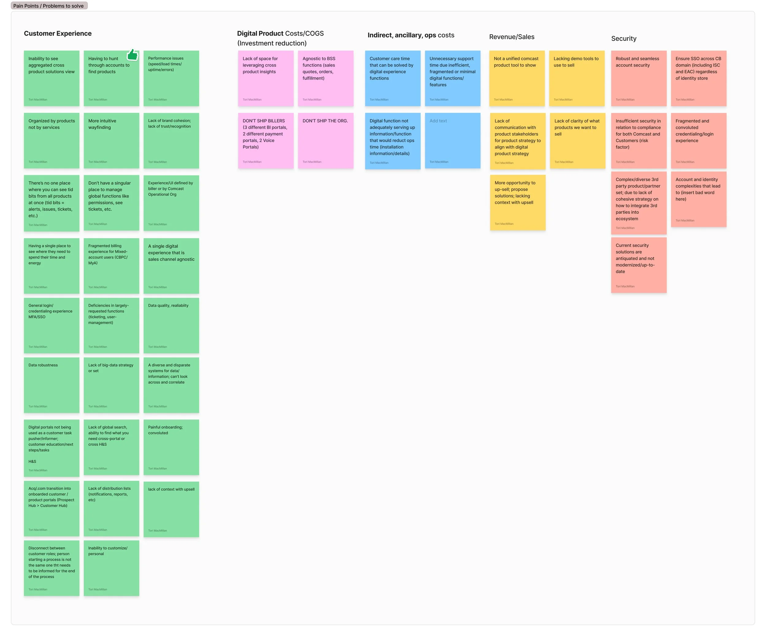
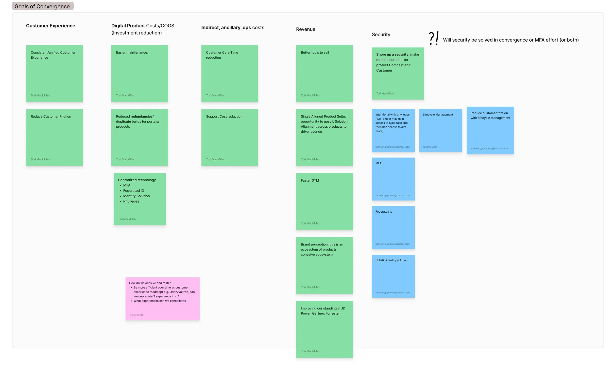
Capturing pain points and goals early in the process
Discovery
The team began by identifying pain points in the existing system as well as goals for the solution.
Unify dozens of internet products in one pain of glass
Allow customers to easily switch between locations and accounts
Create a visual cohesion among all products
Reduce friction and maintenance time for users
Unify product types together (Connectivity, Security, etc.)
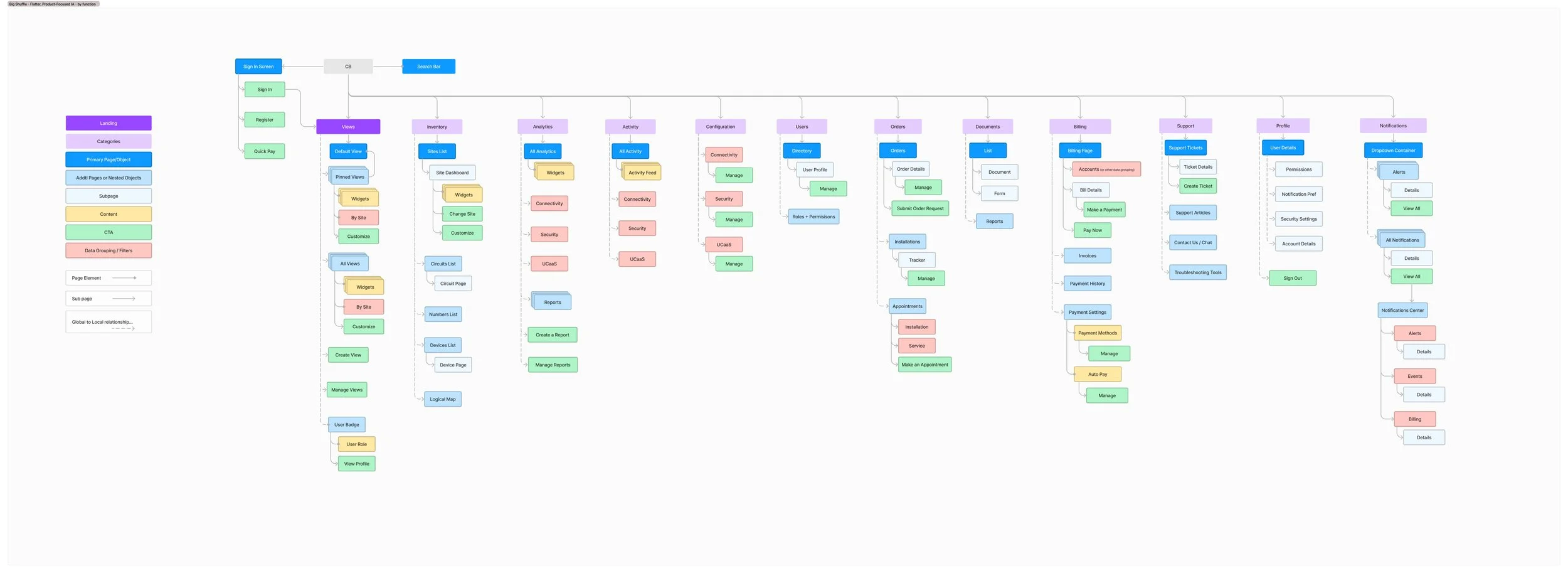
An early information architecture concept
Collective reasoning
We started building up concepts for information architecture and how all the different account types within CB could be considered and provided for. My team worked closely with leadership and product owners to determine the breadth of needs. This often meant communicating with design teams that had been siloed into their specific products for years.

Identifying different account types
A landscape of teamwork
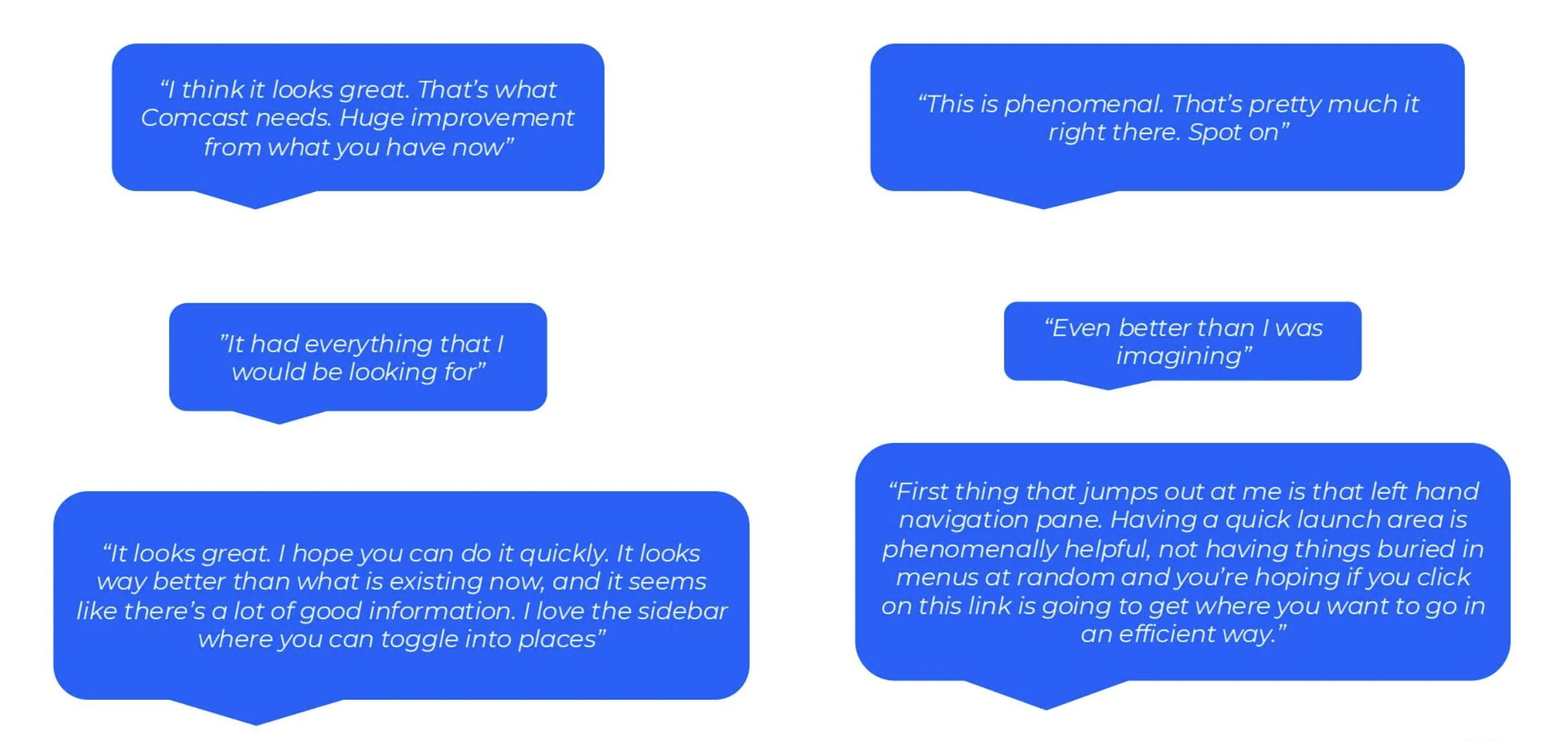
The solution is a design system and information architecture overhaul we refer to as “Convergence”. We have been in the process of rolling out the convergence experience over the course of the year. We have weekly meetings to discuss new features, needs, and system maintenance. Our working team is a group of over 50 designers, engineers, product owners, and content writers. We shared an early prototype of the new experience with some users and got very positive reactions:
The design system:
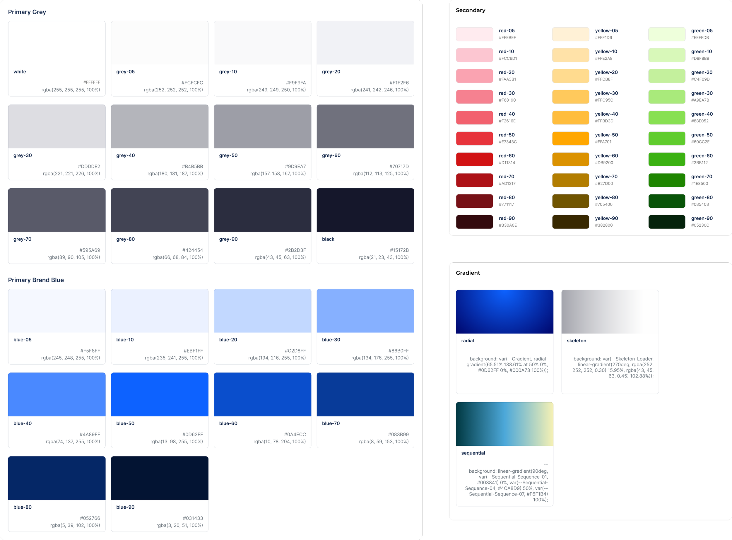
Color
The CB design system uses 32 primary colors for basic page building and UI,
50 secondary colors, 9 dedicated data visualization colors, as well as three gradient styles.
Typography
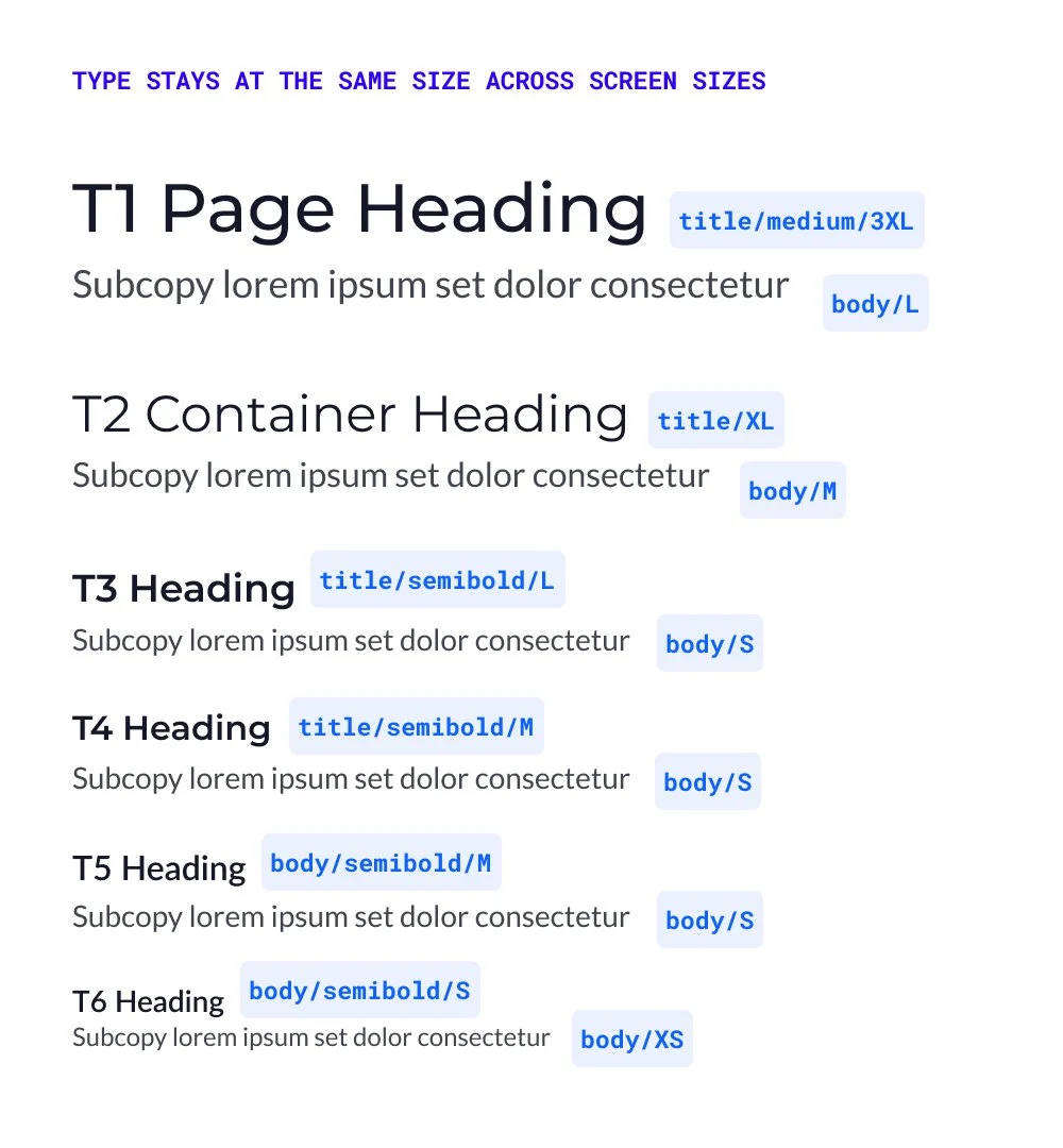
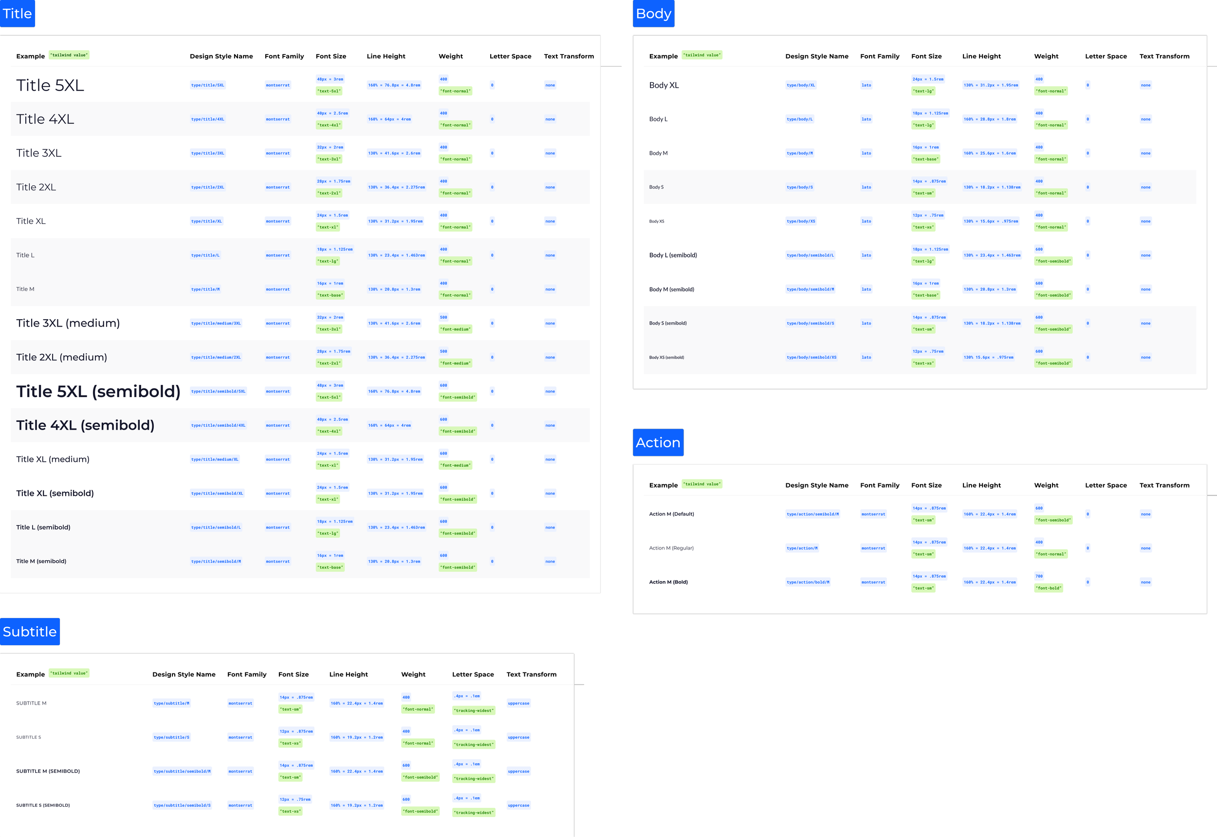
The typographic system for CB consists of Titles, Subtitles, Body, and Action styles. Each style has a standard scale hierarchy.
Here is an example of the typestack:
Buttons

Iconography
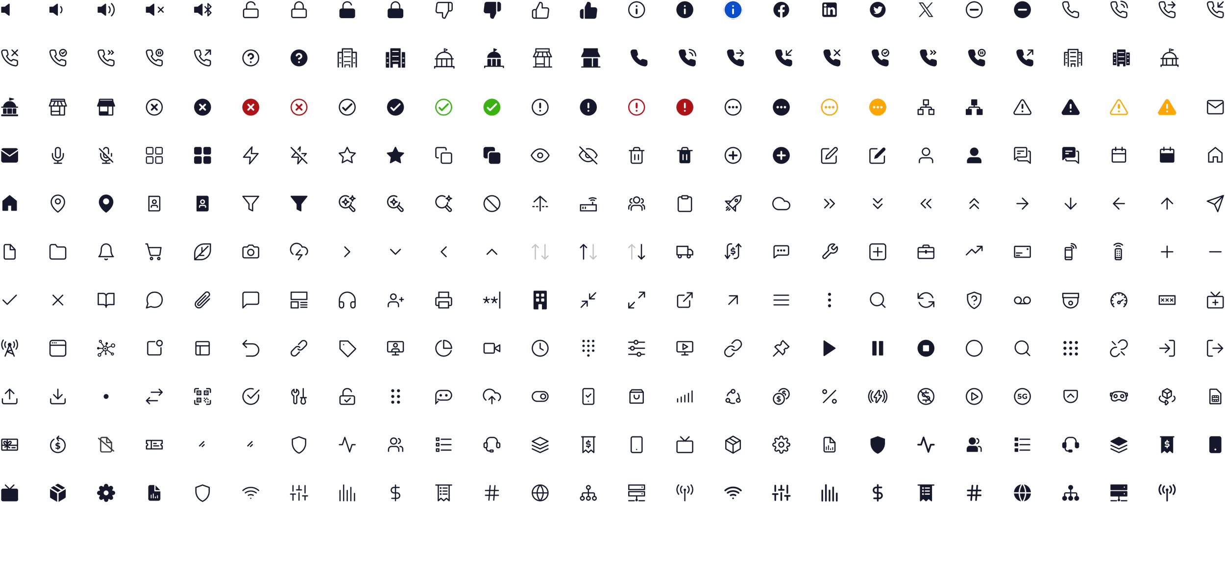
This is a sampling of our icon system. Icons are used in navigation, buttons, and CTAs.
Icons associated with certain products and platforms help the users keep track of where things are across the experience.
Our icon library is always expanding as new customer needs are uncovered.
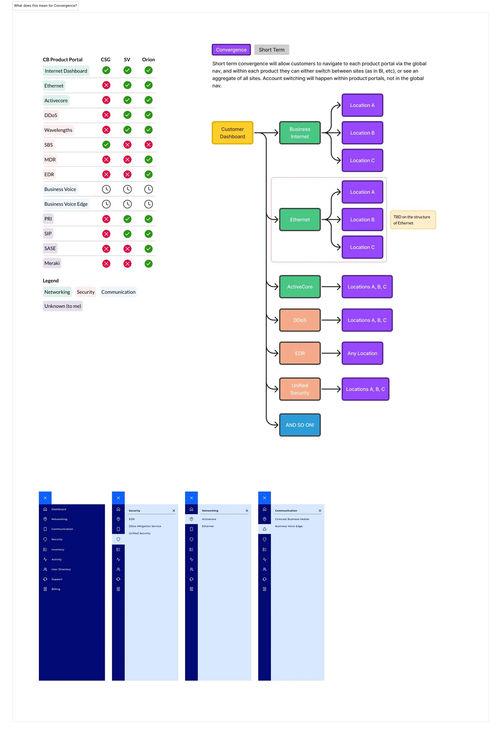
Navigation
The navigation was a significant challenge as part of the design system effort. We needed to create an experience where any customer would have a consistent experience, no matter what products they have, or how many accounts they have.
We developed an account switching system within the nav, as well as a distinct in-product navigation system in addition to the global nav. Now our customers know how to easily access their products from any account within their organization.